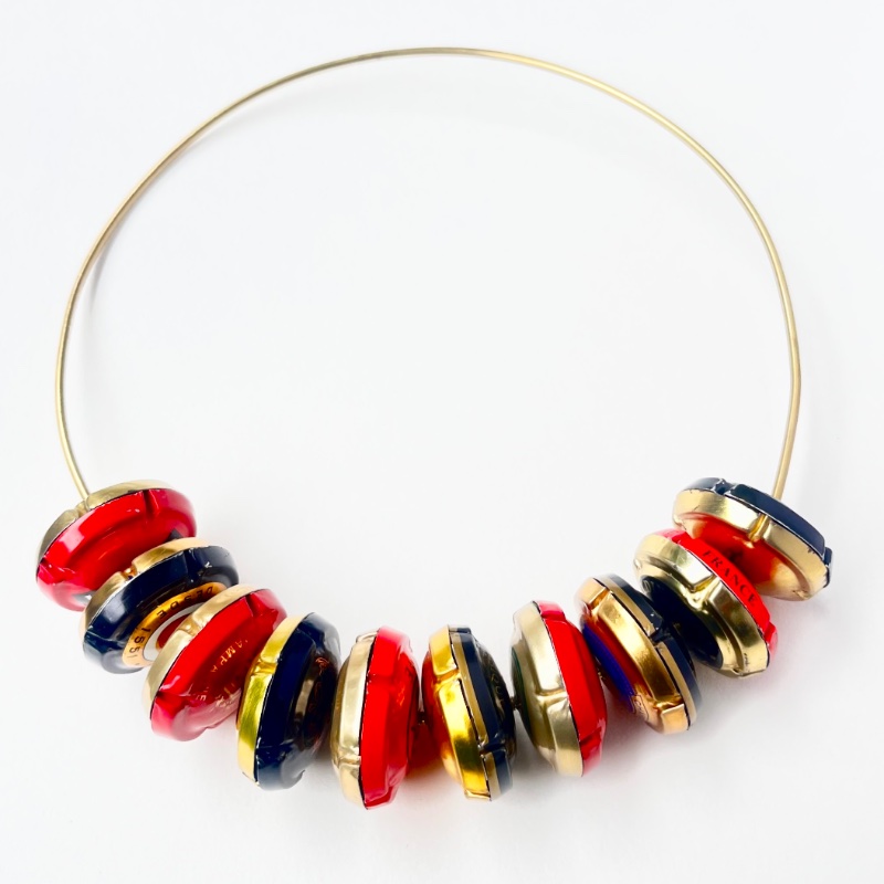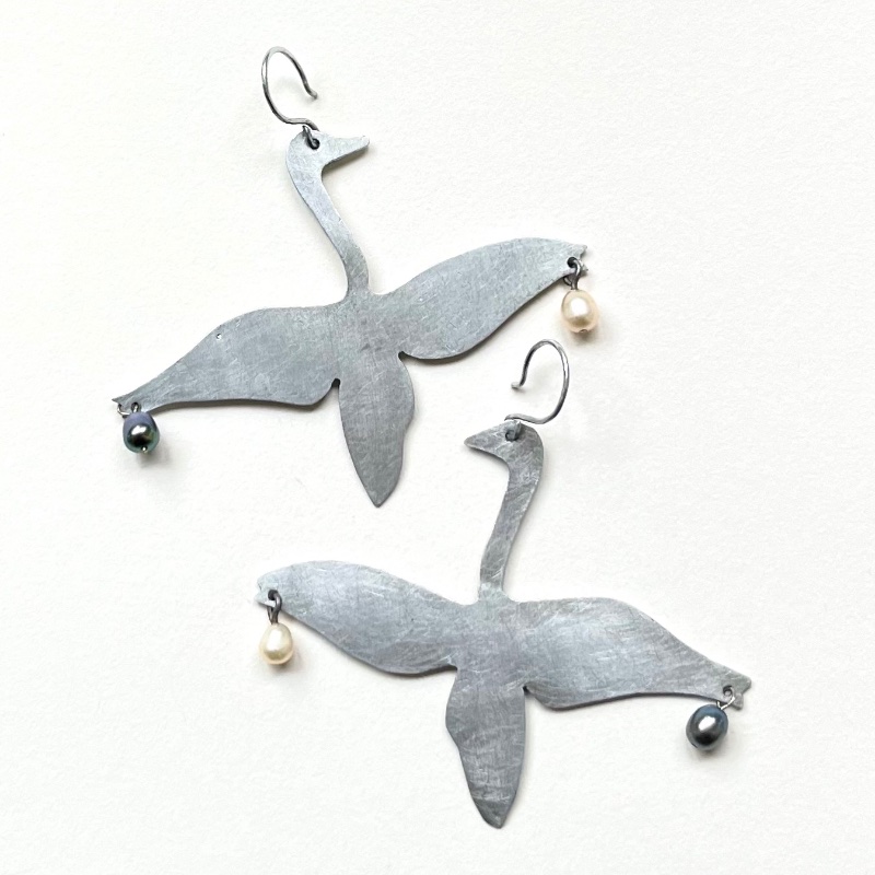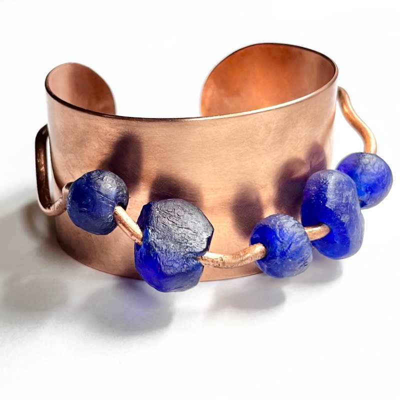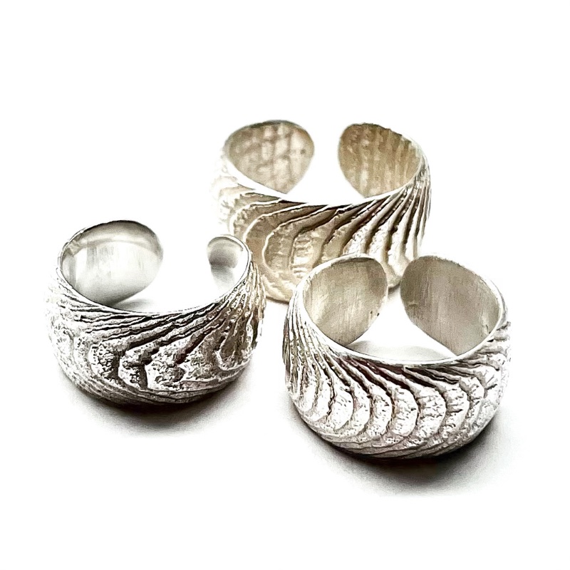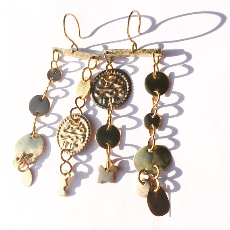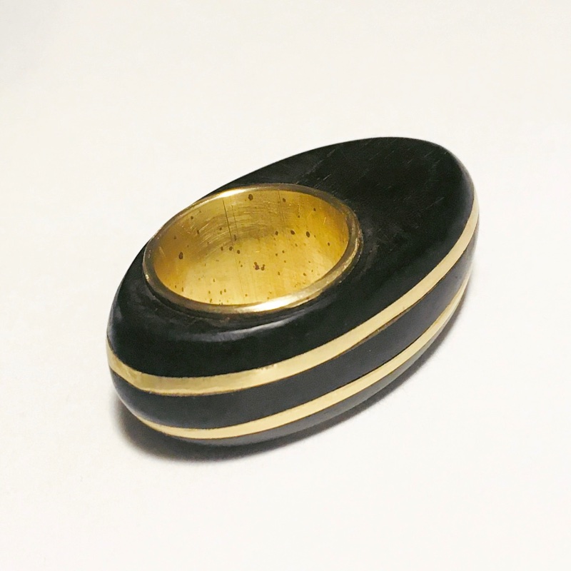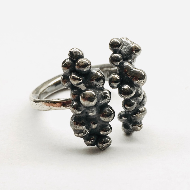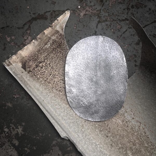
Available works
For enquiries, get in touch.
Archive
For enquiries about similar designs, get in touch.
01 Jewels/
“…the vitality of forms is revealed by the interplay between space and volume.” – Barbara Hepworth (Carvings and Drawings, 1952)
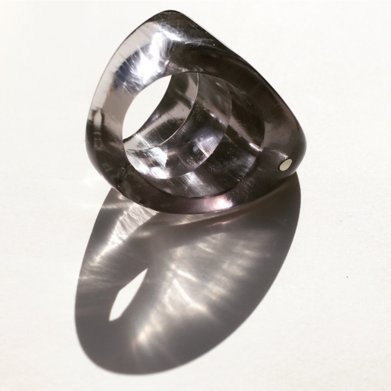
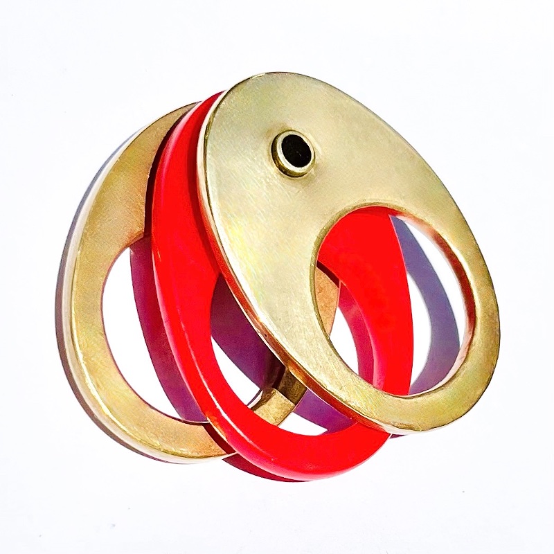
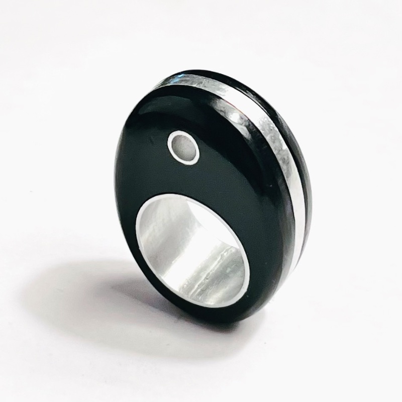
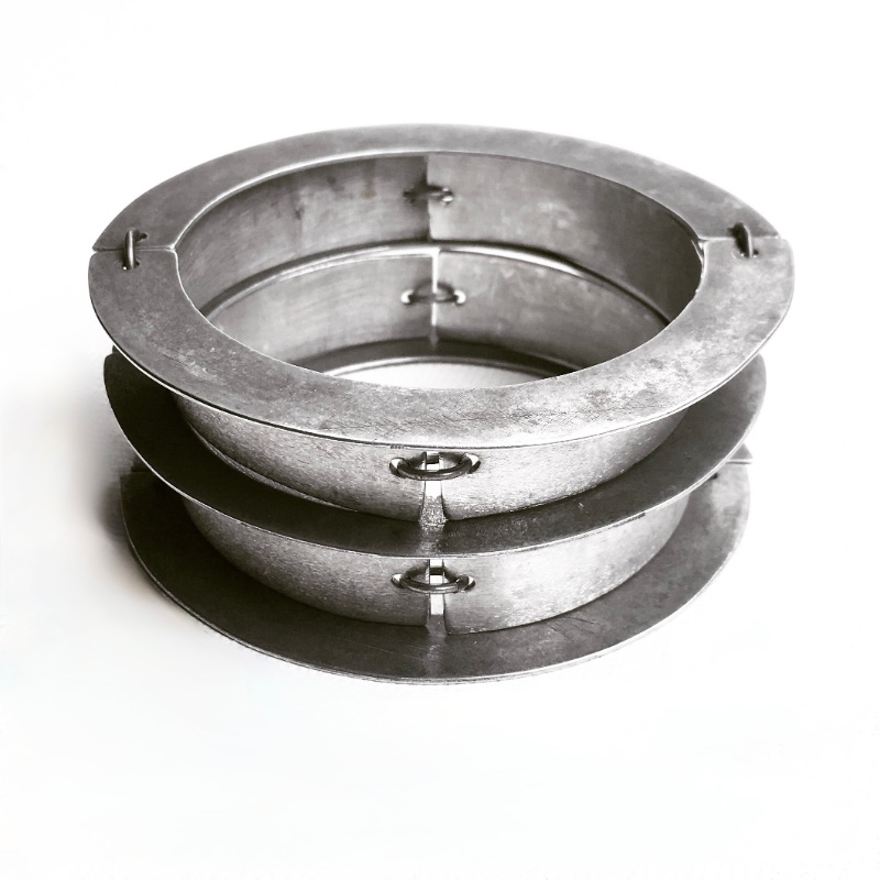
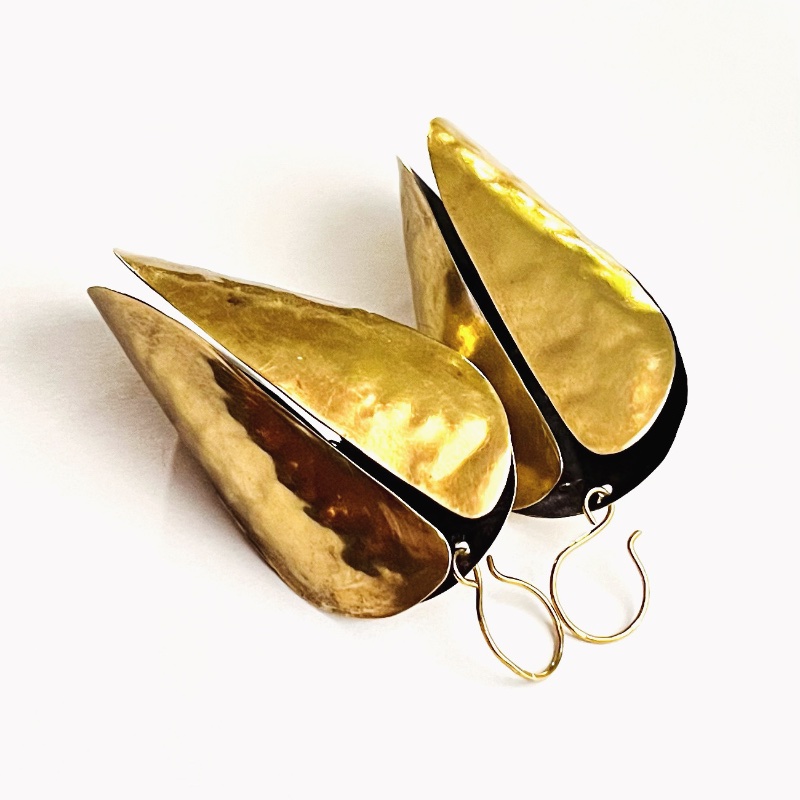
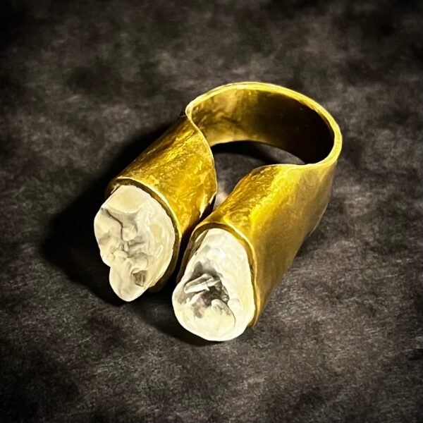
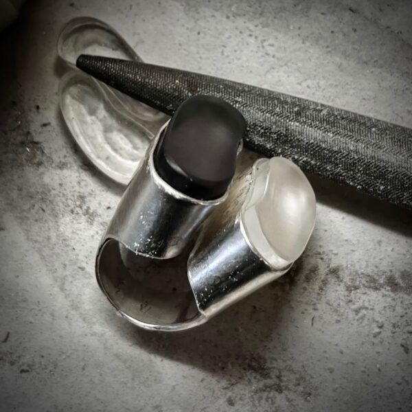
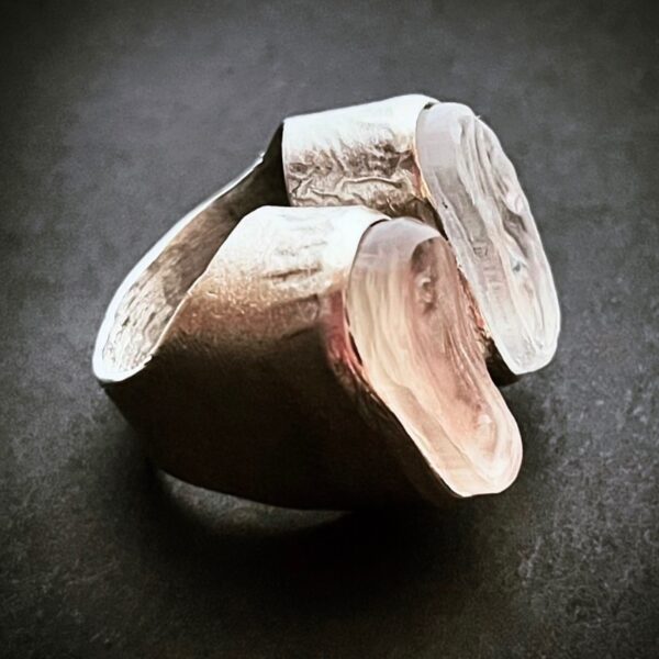
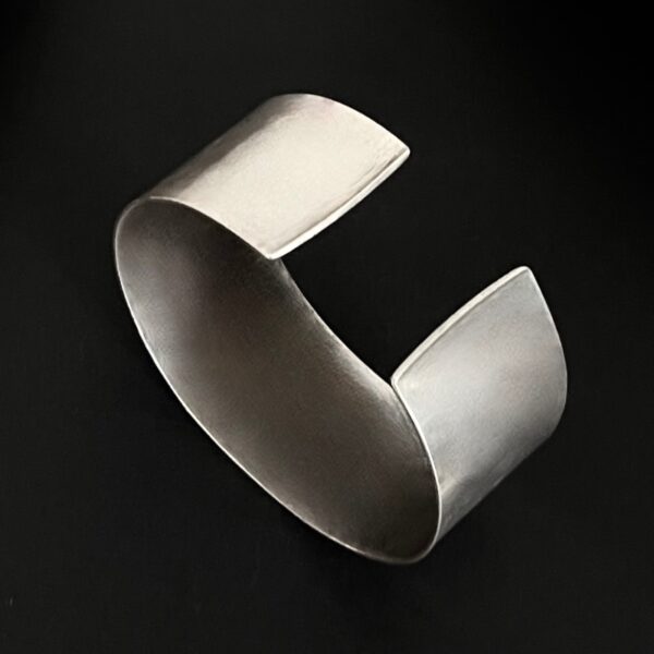
Integral to my specific form fascinations, is my slight obsession with negative space – the shape, colour or absence thereof of the around, above, under, aside and in between. It is the opposite of positive space (the subject/object in a work of art), providing contrast and balancing a composition. I think about this concept and how to use it in my designs for every series but in this one, it is specifically about the space in between.
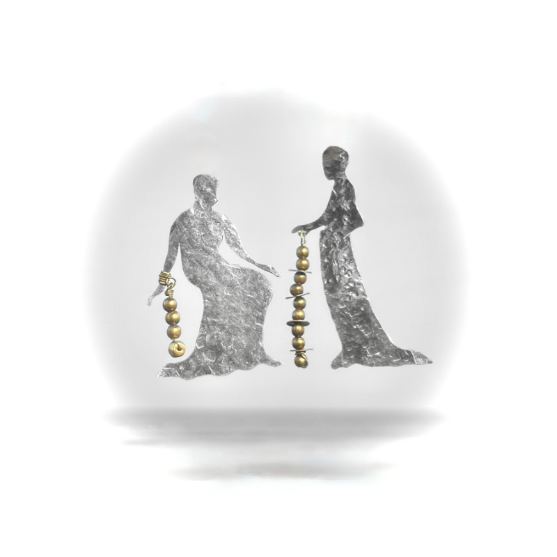
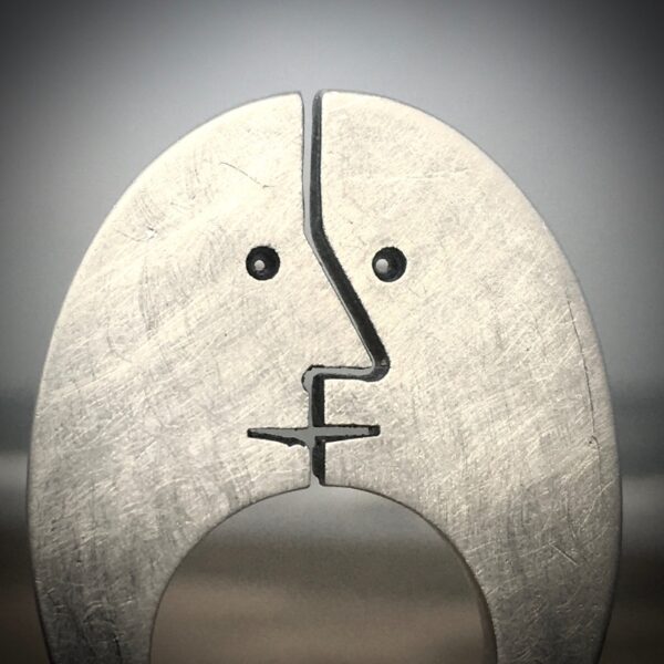
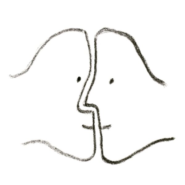
The space in between people and peoples can be a fine line and possibly create positive or negative tension. The difference between a kiss and an almost kiss, a touch or not quite, the space between ‘us and them’, boundaries, borders and the borderline…
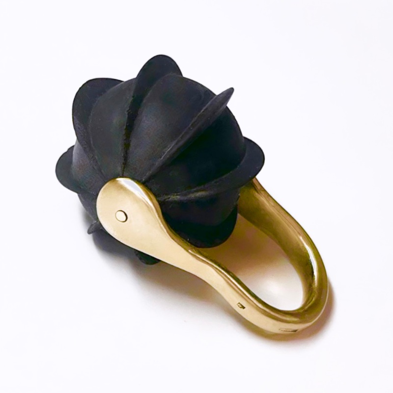
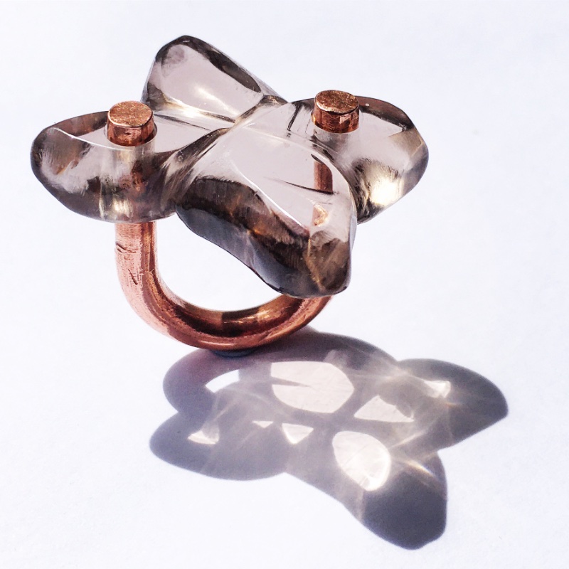
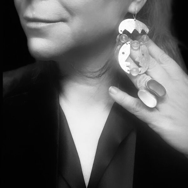
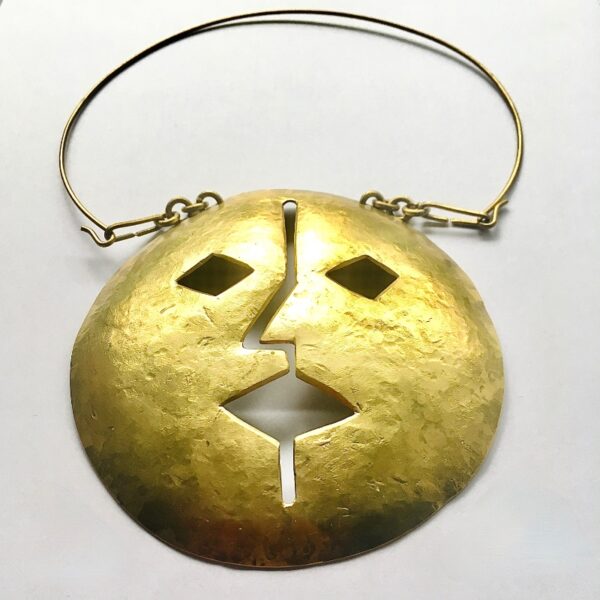
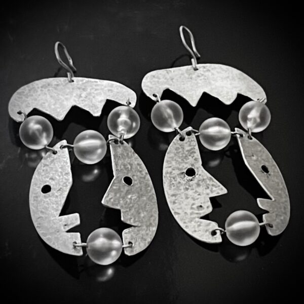
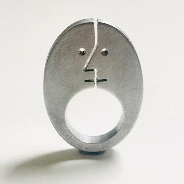
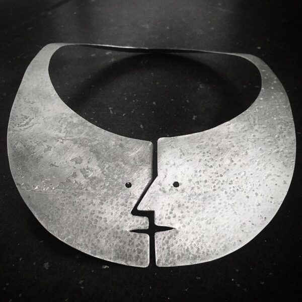
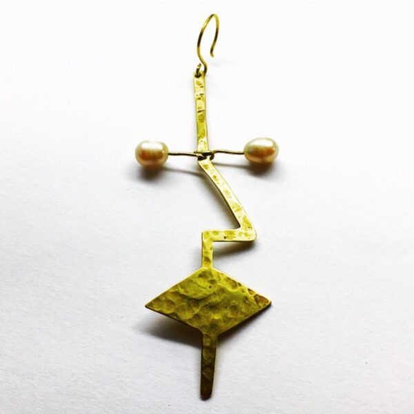
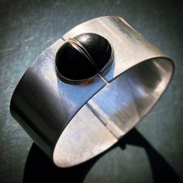
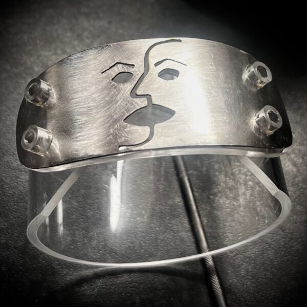
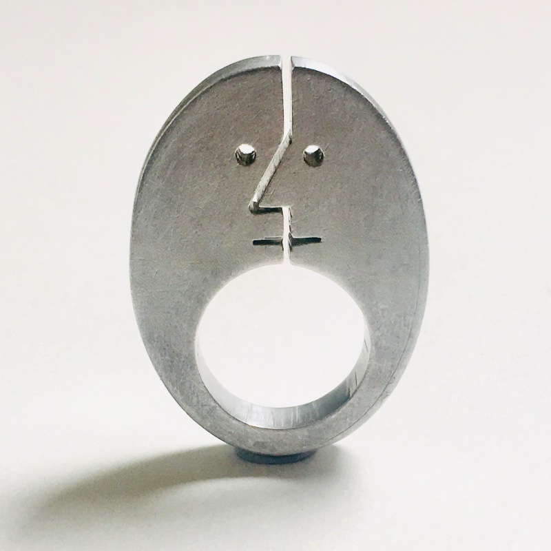
Although, technically speaking, negative space is not a form, I see it as a conceptual form that inspires this series. The designs can take any shape, so long as the tension of the space in between is palpable, and range from figurative, stylised face silhouettes to abstract, organic forms.
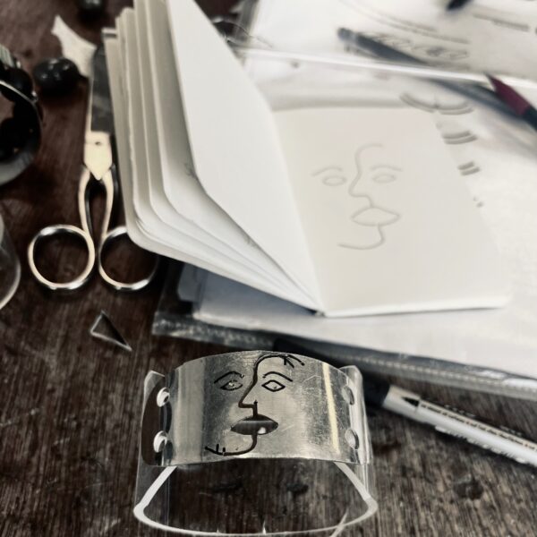
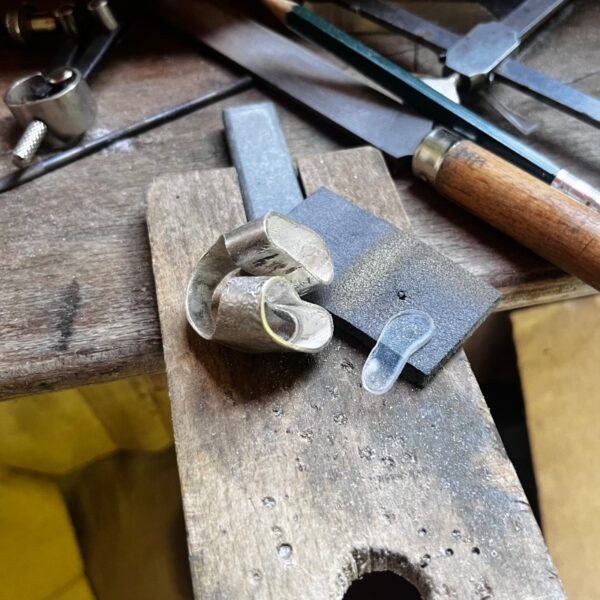
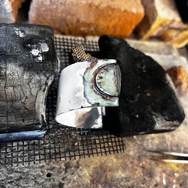
The techniques for this series range from using basic off-the-grid tools, like a hammer and file, to more extensive fabricating, including soldering, but they all require a piercing saw to create the space in between.
Salvaged or offcut scrap metals like aluminium, brass and zinc. For some pieces, I incorporated Perspex and donated repurposed silver(plate).
“Don’t look at things — look in between things.” – John Baldessari (cited in NYT obit. ’20)
01 Jewels/
“…the vitality of forms is revealed by the interplay between space and volume.” – Barbara Hepworth (Carvings and Drawings, 1952)
Integral to my specific form fascinations, is my slight obsession with negative space – the shape, colour or absence thereof of the around, above, under, aside and in between. It is the opposite of positive space (the subject/object in a work of art), providing contrast and balancing a composition. I think about this concept and how to use it in my designs for every series but in this one, it is specifically about the space in between.
The space in between people and peoples can be a fine line and possibly create positive or negative tension. The difference between a kiss and an almost kiss, a touch or not quite, the space between ‘us and them’, boundaries, borders and the borderline…
Although, technically speaking, negative space is not a form, I see it as a conceptual form that inspires this series. The designs can take any shape, so long as the tension of the space in between is palpable, and range from figurative, stylised face silhouettes to abstract, organic forms.
The techniques for this series range from using basic off-the-grid tools, like a hammer and file, to more extensive fabricating, including soldering, but they all require a piercing saw to create the space in between.
Salvaged or offcut scrap metals like aluminium, brass and zinc. For some pieces, I incorporated Perspex and donated repurposed silver(plate).
“Don’t look at things — look in between things.” – John Baldessari (cited in NYT obit. ’20)
For enquiries, get in touch.
For enquiries about similar designs, get in touch.
01 Jewels/